kalyncomputers
-
Posts
99 -
Joined
-
Last visited
-
Days Won
1
Everything posted by kalyncomputers
-
Why not upgrade to Version 6.0.1? It would solve all theses sill problems. Tim
-
Had a fiddle with the logo - thinned it down a bit and added some space above and below and I have to say that I do think it looks better - the client probably won't notice! Login/Register - that one is proving a little more tricky for me with my limited knowledge of php & html. I can do a link and display it but not in the right place, it either sits above the basket which is ok-ish or immediately above the right column which I don't like. So I had and idea and, just for the time being, I have created a category called Login/Register and it now sits in first place on the top bar. Until I can work something else out or someone comes up with a bright idea, that'll do for the moment! Tim
-
Thanks for the comments. Ian I agree with you about the logo, it was designed by the client so it is untouchable! Having said that, I could add 10 pixels of transparency to the bottom - hmm - good ide, thanks. As for the login/register buttons - good idea - I'll play with that. Tim
-
Sorry Johanna but.... You have at least 4 different fonts on the front page, the colours don't sit well on the background. And that's just for starters. Sorry to be negative because you have some nice products and I do like what you have done with the background on the basket and featured product. I would have thought for a shop selling jewellery that you would want something a bit lighter and 'airy'. Tim
-
Bet you can't browse and NOT want to buy something!
kalyncomputers replied to CHGTF's topic in Show Off
Don't think much of your logo - looks a bit low res to me. Takes quite long time to load - might be an image size issue. Sorry - I don't want to buy anything but I'm sure lots of folk will! Good luck with it. Tim -
It's an OK store but.... The yellow highlighting is NAFF! It looks very amateurish - There are much better ways of drawing attention than yellow highlighting. You say that you only ship to Australia - but if I order something I am given the option of Australia, Hong Kong, Gurnsey and Jersey - delete the extra countries. Your copyright notice at the bottom needs to be centred. As Al said, that's an old version of CC - have a look at version 6 - it is good and not a huge job to upgrade - lots of help available if you need it. Tim
-
Looks very nice - well done Tim
-
Agree completely about the splash page - totally unnecessary, serves no useful function except to put me off! Tim
-
Looks very nice. I suggest that you turn empty categories off - really puts me off to visit a category and find it has no products to see. Tim
-
Not so sure about the pink but it's a nice clean site. Good luck
-
My clients likes the look of CC6 so I have done a test install on a spare domain - http://www.labpif.com I haven't done much hacking and I still have one minor thing to sort out - background colour for the cart and login but.... I have learned a lot about the way the Foundation skin works it isn't easy but it ain't to hard either, particularly with help from Al and bsmither and reading lots and lots of posts from other people. Play as much as you like - there are no payment options installed but everything else works - I hope. Tim
-
Foundation - minor change
kalyncomputers replied to kalyncomputers's topic in Customising Look & Feel
OK - we are there! Thanks to all who gave me pointers to the bits of code that need to be changed. I now have exactly what I want - no major hacks but something that looks clean and loads like the proverbial off a shovel. I know it's only a simple shop but have a look at www.labpif.com - my client is delighted. Any comments or brickbats gratefully received -
No Decimal point in currency
kalyncomputers replied to kalyncomputers's topic in Customising Look & Feel
I have started a new topic about this in General Support '?do=embed' frameborder='0' data-embedContent>> because I think there is a database problem. Al, I do follow instructions - but I like to experiment! Tim -
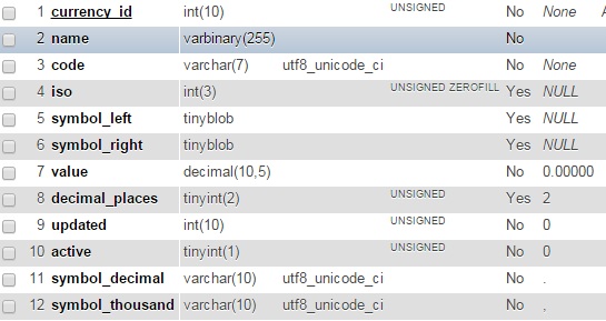
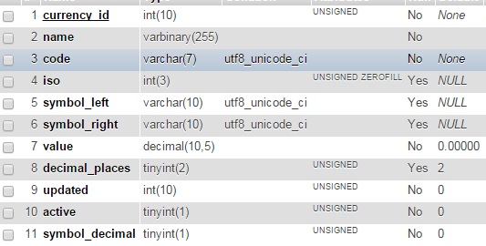
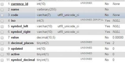
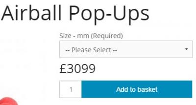
I thought I would start a new topic about this in General technical Support because I am pretty sure it isn't skin related. I am testing 6.0.0 for a client. I installed a clean copy of 5.2.12 on a test domain, populated the database and tested - everything worked. I then used the UPGRADE tool in CC to upgrade to 6.0.0 - that went fine except that the currency has no decimal point and an extra 0 has been inserted in the price so something that should cost £3.99 now costs £3099 - great if you can someone to buy it! I tried to change the decimal symbol in admin but it didn't change. After much head scratching, I decided to look at the database with myphpadmin. Looking at the currency table I could see that the default currency separator is a 0 - no problem, I'll just edit it. When I try I get an error message and won't accept the change. So, I did the same thing on another test domain and this time I installed 5.2.12 and then I installed 6.0.0b6 and everything worked exactly as it should, decimal point in the right place. So I looked at the database on both sites and I found that the currency table in 6.0.0b6 is different to 6.0.0, the pictures below show the difference. The one on the left is 6.0.0b6, the one on the right is is 6.0.0 So now I know what the problem is but I don't know how to solve it. Is this just me or is anyone else having the same problem? Tim
-
No Decimal point in currency
kalyncomputers replied to kalyncomputers's topic in Customising Look & Feel
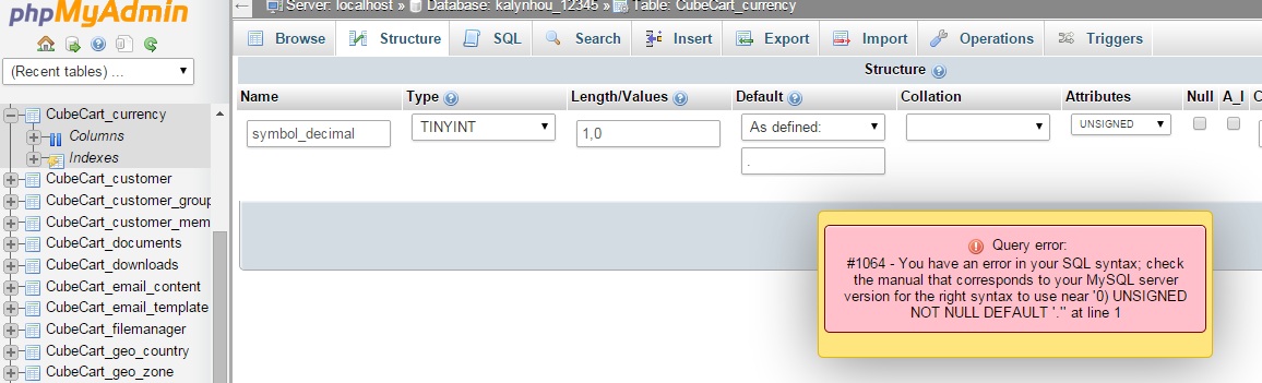
Before going down the reinstall route, I thought I would have a look at the database and that is where the problem is. I have to be honest, I don't understand the way that MySql works, so I don't understand the error message I get when I try to change the default 0 to a point. Is it my server or a big? Tim
-
No Decimal point in currency
kalyncomputers replied to kalyncomputers's topic in Customising Look & Feel
I installed a clean copy of 5.2.12, made sure it was working and then upgraded using upgrade from the admin side. That worked fine. I then imported the database with phpmyadmin - no problems. My first thought was to look at the currency settings and sure enough I think that is where the problem is. The decimal point is set at 0 and I can't change it via the admin side. I am now going to remove everything and try installing a clean copy of 5.2.12 and using the overwrite method of upgrading to 6.0.0. I'll be back! -
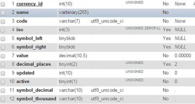
*** Solution Here: '?do=embed' frameborder='0' data-embedContent>> *** Installed 6.0.0 over a 5.2.12 install on a test site. Everything went fine, no errors or warnings. One problem, no decimal point in the currency - as per image. Correct price should be £3.99 so in fact there is an extra 0 as well. The database was imported in 5.2.12 and worked fine. Currency settings are correct in SETTINGS I am sure I have seen this before - have I? Or is it to late for my tired old brain! Tim
-
Foundation - minor change
kalyncomputers replied to kalyncomputers's topic in Customising Look & Feel
Thanks again bsmither - issue 1 is now resolved. Issue 2 - getting there - thanks Tim -
Foundation - minor change
kalyncomputers replied to kalyncomputers's topic in Customising Look & Feel
Just what I needed! Thanks Tim -
I have a client who really likes the Foundation skin except for a couple of things. 1 - the font colour - he would like it to be black . I have played with the foundation.min.css and I can change everything to black but...if I do, then of course the text in bottom footer, e.g. Terms and Conditions is not visible. Can you point me in the right direct to change the colour in the footer to white? 2 - Logo size - much as I have hunted, I can't find where to change the logo size - some ideas would be appreciated. I am very impressed with the release version of 6.0.0 - it ain't half fast! Tim
-
Hi, Thanks for all the ideas. Al - I now have the min file as 'readable' code. The changes I need are minimal - I like it as it is except for some font colours and things like the size of the top logo. I'll also have a look at cubecart.css. bsmither - thanks for the code edit - knowing you, I am sure that will solve it! Tim
-
Is there any reason why the Terms & Conditions and Privacy Policy appear twice when using the Foundation Skin? As others have said, the foundation.min.css is almost impossible to edit. I am sure I saw somewhere that foundation.css, i.e. the 'un minimised' file is available somewhere - if that is true, where is it? I know that by adding to the cubecart.default.css rules can be changed but I think it is almost as difficult a job as editing the min file because you have to find all the classes which, even using a css viewer is a very time consuming job. Thanks Tim
-
Chrome on Windows 7 looks fine here Tim
-
Changing Foundation Layout - need help
kalyncomputers replied to Dirty Butter's topic in Customising Look & Feel
Hi Have to admit that when I first saw Foundation, I thought, 'why is the column on the right'. However, Having populated a test site with 1150 products and looked at them, I have to say that I think having the column on the right is much better. It keeps the focus on the product being viewed. Just a personal view but a couple of people who have seen the test site agree. What would be really nice is if the menu bar could be left floating when product details are scolled down. However I know that this is not a simple job! Speaking of why I took this life up and changing for something else, how about a becoming a dustbin man? I used to know one who made a fortune picking scrap out of the bins he emptied. Probably not the same now that we have wheely bins. Tim -
Hi, Having another little poke around 6.0.0b7. One small issues: I upgraded from V5.2.13 as per the instructions. Everything fine EXCEPT that the store settings, i.e. Storename & address were not imported. I am pretty sure that when I looked at 6.0.0b6 they were. However, this is not a major problem. What I would like to know is the location of the css for the Foundation skin. I have to say that I rather like it and, much to my surprise, one of my clients absolutely loves it - this after I spent quite a bit of his money, modding Mican Blue. If he decides that he want to change to Foundation, then I will need to make some changes to font colours so I do need to know which css files I will need to edit. Thanks Tim